Floatin’ in space, oh my
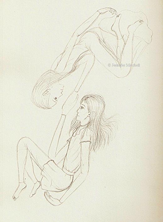
Well, guess what this is! Hint: look at the top left of your page. The very top. No, higher than that. No, lower than the toolbar. …Yeah! It’s the ‘site logo’ thingy that I made up to go as part of the title image. Except in pencil. Looks pretty similar, doesn’t it? After I get near everything else up, then I’ll post the colour version and you can see that, too.
So, this is the natural outcome of the earlier Symmetry pictures. With my own characters, instead.
People keep praising kneadable erasers. Am I using mine wrong? It doesn’t seem to work for me.