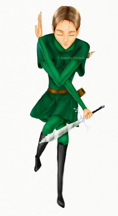
Glitter, glitter, little sword
And now Zela in colour. Original here. The colour really brings out the proportional deficiencies, I think, but I also think the cloth at her waist looks really good for some reason. I had some trouble with layers and the multiply function… that’s why there are some white lines and some dark lines, instead of it all being just smooth. I guess I like the shiny sword a lot, though the hilt ought to be more detailed… I guess there’s only so much you can cram into those pixels. Also the hair is okay.
There’s so much I want to do right now! Photoshop painting, Ceniro movie, write Fire Emblem 7… I re-read as much of my story as is on here last night and I felt… I have up to Chapter 10 or so written, so why not put it up? Because it needs work, that’s why. Well, I’m going to work on Photoshop, I think.