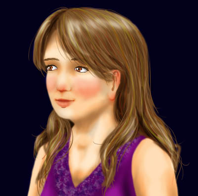
Three weeks until my grad recital! So I’m working on the poster. Here is a preview. The background will probably be a light colour but I may change my mind. I do like pictures with deep rich hues in addition to pretty pastels.
Thoughts? What needs improving? I think I need to touch up the end of the nose because it’s not really coming out of the face like a nose should. Also my eyes aren’t that bright brown.