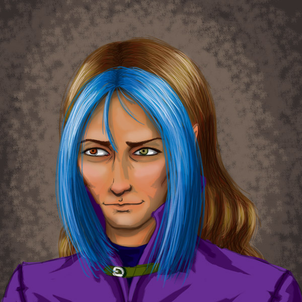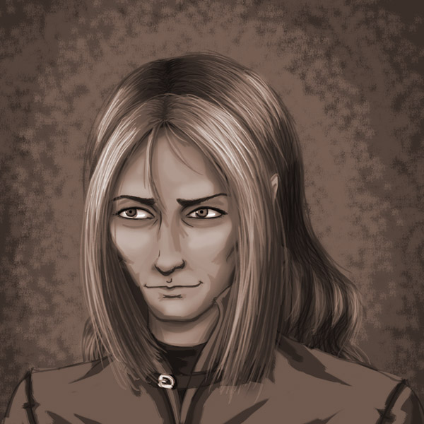

A quick, messy portrait of Tam for ye! I’ve found a Photoshop default brush that I really like – it sort of impersonates a paintbrush, particularly when used with several layered shades. Had a terrible time getting his skin colour right; he’s a tanned dude…
I think I actually like the sepia one better, which is good, because the project this is destined for uses it in sepia.
I would like to go back and clean this up; do a real painterly portraity painting of this, because I spent most of the detail work on the eyes (and then you can’t even really tell : P C’est la vie.). Should probably thank this tutorial for being helpful! Also I used ArtsAngel’s painting that I commissioned a while back with reference for clothing, because she did a wonderful interpretation of his clothes and it’s totally canon now and I’m going to try to draw them that way forevermore. Just FYI.
This took about two hours. Only two hours? I’m kind of amazed at that… it felt longer. Well, time… sometimes does fly… when you’re having fun? Because I felt like I enjoyed myself for longer? Huh?
I said I wanted to draw my own folks a bit… Well, here I am.
Guest art is going to go up for the next bit! Results of the other half of the sketch commissions, the ones where I requested something. It’s quite interesting! First up, Rana.
I really love his design. <3 I love the blue in his hair, but you're right, I think the speia one looks better, too. Not that I don't like the color one. 😉
Yeah, Tam was a cool cat who showed up one day, sat down, and said “I’m going to take this role. By the way my hair’s blue and I’m a total badass.” And the commission I had from ArtsAngel helped too, because she jazzed up his design brilliantly. I can’t design interesting clothing very easily, but she put in all kinds of realistic little details that I love.
I think it’s because the colours are oversaturated in the colour one, but in the sepia one, we just get values, so the blue and purple aren’t glaring. I’ll tone it down next time I do him. I just used colours on the default palette of Photoshop7, which maybe isn’t the best way to work. : P
I’m glad you like both, though! : D
It’s always the badass ones that are the most awesome.
Oh, and chapter two will probably be up sometime this week. ^_-
Along with some art ~ Because I need to stop drawing them just as Chibis, and Lusiel has been haunting me.
Yaaaaay!!! Can’t wait!